 en español
Visual Analytics Techniques for the Improvement of Efficiency in Processes and Buildings
Project data
| Call | National R+D Program Oriented to Society Challenges (Programa Estatal de I+D+i Orientada a los Retos de la Sociedad) |
| Reference | DPI2015-69891-C2-2-R |
| Title (coordinated project) | Modeling, Forecasting and Interactive Data Visualization Techniques for the Improvement of Energy Efficiency in Buildings and Industrial Facilities (ENERGYDATA) |
| Partners | UniLeón (grupo SUPPRESS) UniOvi (grupo GSDPI) |
| Duration | 1/1/2016 - 31/12/2018 (extended until 31/12/2019) |
| Project abstract | Energy efficiency and savings policies have become a challenge of extraordinary strategic importance for Spain and the EU, as a result of their excessive current and forecasted energy dependence. Despite the huge volumes of data and information available today, these data are not presented in an intuitive way that the user can assimilate. As a result, the decisions in energy management are often taken under insufficient or ill-defined information. Thus, it becomes important to have tools based on the large amounts of data obtained from energy facilities, including both buildings and industrial facilities, which increase our energy awareness, that is, our perception of the use given to energy. These tools should hint strategies to improve energy efficiency. They also should be able to handle large volumes of changing information of different kinds, tolerate imprecision, present information in a clear and intuitive way and also provide a global view. Information visualization allows getting insight from data, through the combination of intelligent data analysis algorithms and the ability and plasticity of the human visual system, which allows the detection of interesting patterns quickly and efficiently. According to this approach, the user is part of the information visualization process and ultimately takes the decisions. The 1st research line proposes the development and application of visual analytics techniques oriented to system and process monitoring that allow the user to discover and understand the factors that affect energy efficiency. In order to improve the exploration process, these techniques combine classification,forecasting and dimensionality reduction algorithms (able to produce visual "maps" of the process states) with principles and techniques of information visualization, as well as interaction. The aim of the 2nd research line is to use the information obtained by the application of previous techniques to data from buildings, facilities and processes in order to improve efficiency in two main areas: a) the efficiency in consumption buildings and facilities, applying the proposed techniques to analyze the behavior of energy demand, and to characterize the influence of environmental variables, as well as to obtain models that enable the tuning of systems and control strategies for a more efficient operation; b) the efficiency in processes, exploring the relationships between factors (process parameters, known variables) and process performance (quality, efficiency), as well as through fault detection and efficiency monitoring. Experimentation in this project will be based on real data acquired from the energy facilities of the Universities of León and Oviedo and the León Hospital, as well as from industrial processes accessible by the partners. |
Recent activity
| 2019-05-15 |
Visit and seminar from prof. Jaakko Hollmén Seminar Prof. Jaakko Hollmén at EPI Gijón about data science |
| 2018-07-13 |
Workshop for presentation of advances in project ENERGYDATA Seminar "Analítica Visual para la Mejora de la Eficiencia en Procesos y Edificios: pasado, presente y futuro" |
| 2016-09-20 | Seminar: "Análisis del fenómeno de chatter para su exploración visual". Daniel Pérez |
| 2016-09-26 | Seminar: "Posibilidades de las técnicas deep learning en analítica visual de procesos y edificios". Ignacio Díaz |
| 2016-10-03 | Seminar: "Análisis de Componentes Independientes (ICA): fundamentos matemáticos y su aplicación en consumos eléctricos". Diego García |
📄 Publications
Journals (JCR)
-
2020
- Ana González-Muñiz, Ignacio Díaz, and Abel A Cuadrado, "DCNN for condition monitoring and fault detection in rotating machines and its contribution to the understanding of machine nature". Heliyon. 6(2): e03395, 2020. [→ web][→ pdf] 2019
- Serafín Alonso, Daniel Pérez, Antonio Morán, Juan J. Fuertes Martínez, Ignacio Díaz Blanco, and Manuel Domínguez González, “A Deep Learning Approach for Fusing Sensor Data from Screw Compressors”. Sensors. 19: 1--18, 2019. [→ web][→ pdf] 2018
- Daniel Pérez, Ignacio Díaz, Abel A. Cuadrado, José L. Rendueles, and Diego García, "Interactive data visualization of chatter conditions in a cold rolling mill". Computers in Industry. 103: 86-96. Dec, 2018 [→ web] [→ pdf]
- Diego García, Ignacio Díaz, Daniel Pérez, Abel Cuadrado, Manuel Domínguez, and Antonio Morán, "Interactive visualization for NILM in large buildings using non-negative matrix factorization". Energy and Buildings. 176: 95-108. Oct, 2018. [→ web] [→ pdf]
- Alexander Endert, William Ribarsky, Cagatay Turkay, William Wong, Ian Nabney, Ignacio Díaz, and Fabrice Rossi, "The State of the Art in Integrating Machine Learning into Visual Analytics". Computer Graphics Forum. 36(8): 458-486. Dec, 2017. [→ web][→ pdf]
- Ignacio Díaz, Abel A. Cuadrado, Daniel Pérez, Manuel Domínguez, Serafín Alonso, and Miguel A. Prada, "Energy Analytics in Public Buildings using Interactive Histograms". Energy and Buildings. 134(1): 94-104. Jan, 2017. [→ web]
2017
Conferences
-
2019
- Serafín Alonso, Antonio Morán, Daniel Pérez, Perfecto Reguera, Ignacio Díaz Blanco, and Manuel Domínguez González “Virtual Sensor Based on a Deep Learning Approach for Estimating Efficiency in Chillers”. In Engineering Applications of Neural Networks, vol.1000 of Communications in Computer and Information Science, Cham. pp. 307--319, 2019 [→ web]
- Amaro González García, Ignacio Díaz Blanco, and Manuel Domínguez González "Desarrollo de laboratorio remoto de investigación mediante la utilización de tecnologías industriales multiconectadas". In XL Jornadas de Automática. pp. 277--287, 2019
- Diego García Pérez, Ignacio Díaz Blanco, Ana González Muñiz, and Abel A. Cuadrado Vega "Diseño de una maqueta de bajo coste para SHM". In XL Jornadas de Automática. pp. 405--413, 2019
- Ignacio Díaz Blanco, Diego García Pérez, Ana González Muñiz, and Abel A. Cuadrado Vega "Análisis de vibraciones en una estructura utilizando echo state networks". In XL Jornadas de Automática. pp. 186--191, 2019.
- Ignacio Díaz, Daniel Pérez, Abel Cuadrado, Diego García, and Manuel Domínguez "Interactive dimensionality reduction of large datasets using interpolation". In European Symposium on Artificial Neural Networks, Computational Intelligence and Machine Learning. Apr, 2018 [→ pdf] [→ demo application]
- Antonio Morán, Serafín Alonso, Miguel A. Prada, Juan J. Fuertes, Ignacio Díaz, and Manuel Domínguez "Analysis of Parallel Process in HVAC Systems Using Deep Autoencoders". In Engineering Applications of Neural Networks, vol.744 of Communications in Computer and Information Science, Cham. pp. 15--26, 2017 [→ web]
- Iván Machón-González and Hilario López-García "Nonlinear dynamic identification using supervised neural gas algorithm". In 12th International Workshop on Self-Organizing Maps and Learning Vector Quantization, Clustering and Data Visualization (WSOM+) 2017, Nancy, France. Jun, 2017.
- Daniel Pérez López, Abel Alberto Cuadrado Vega and Ignacio Díaz Blanco "Visualización Web Interactiva para el Análisis del Chatter en laminación en Frío". In XXXVIII Jornadas de Automática, 2017. pp. 416-423. Sep, 2017
- Daniel Pérez, Diego García Pérez, Ignacio Díaz Blanco, and Abel Alberto Cuadrado Vega "Bancada para análisis inteligente de datos en monitorización de salud estructural". In XXXVIII Jornadas de Automática, 2017. pp. 424-430. Sep, 2017
- Diego García Pérez, Ignacio Díaz Blanco, Daniel Pérez, Abel Cuadrado, and Manuel Domínguez "Latent variable analysis in hospital electric power demand using non-negative matrix factorization". In European Symposium on Artificial Neural Networks, Computational Intelligence and Machine Learning. pp. 507-512. April, 2017 [→ pdf]
- Guillermo Lomas Rodríguez, Abel A. Cuadrado Vega, and Ignacio Díaz Blanco "Estudio de la relación entre la frecuencia de chatter y la velocidad en un tren de laminación en frío mediante técnicas de analítica visual". In XII Simposio CEA de Control Inteligente. pp. 37-42. Jun., 2016
- Daniel Pérez, Ignacio Díaz Blanco, Abel A. Cuadrado Vega, Iván Machón, Manuel Domínguez, and Hilario López García "Analítica visual del fenómeno de chatter en un tren de laminación en frío por medio de técnicas de análisis inteligente de datos". In XII Simposio CEA de Control Inteligente. pp. 43-48. Jun., 2016
- Ignacio Díaz Blanco, Abel A. Cuadrado, and Michel Verleysen "A State-Space Model on Interactive Dimensionality Reduction". In European Symposium on Artificial Neural Networks, Computational Intelligence and Machine Learning, Bruges, Belgium. pp. 647-652. April, 2016. [→ pdf][→ pdf poster][→ pdf spotlight]
2018
2017
2016
Videos
The next videos show some of the visual analytics techniques developed during the project.
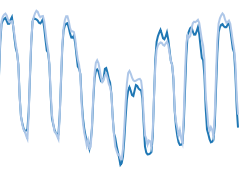
| Visual analytics of process data |
iHistograms Power demand analysis (univ. campus) (Díaz et al, 2017) |
iHistograms Air quality analysis (Díaz et al, 2017) |
| NMF + iHistograms Power demand analysis in a hospital (García et al, 2018) |
tSNE + iHistograms Visual analytics of cold rolling data (Pérez et al, 2018) |
🕹 Interactive demos
Interactive data cube visualization
 |
iHistograms: electric power demand |
Original version of the interactive data cube visualization webapp, showing electric power demand data from a university campus, published in Energy and Buildings [→ publication web page] and developed during the project. |
|
iHistograms: interactive histograms | Version of iHistograms for visualization of the quality of air in Gijón city from open datasets available in datos.gijon.es from Ayuntamiento de Gijón. |
Interactive visualizations of power demand data
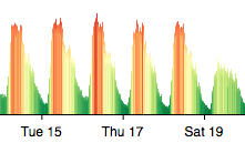
These sample visualizations show different ways to visualize demand data using specific visual encodings that take advantage of problem domain knowledge to disentangle patterns on data (structure, periodicities) and to highlight informative features.
 |
Spiral web visualization | Basic example of spiral web visualization for several electric power demand parameters from a hospital |
 |
Interactive web visualization (zoom, pan) | Basic example of interactive web visualization of electric power demand in a hospital |
 |
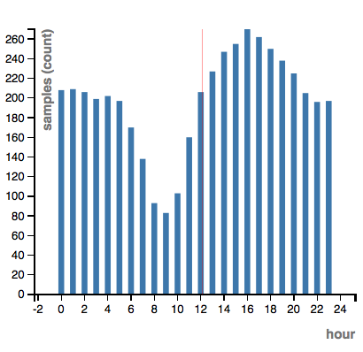
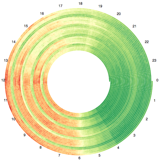
Power factor visualization | Example of power factor visualization in a rural area, aggregated by day hour and weekday |
 |
Electric demand forecasting in UK | Example of electric demand forecasting in july 2013, from training data between may 2011 and may 2012. The example uses an extreme learning machine (ELM) algorithm. |
Interactive dimensionality reduction
In these web-based data visualizations we use an interactive version of a manifold learning algorithm (stochastic neighbor embedding (SNE)) to show the data to the user in an organized way according to criteria that he/she can change. In these visualizations, the multivariate elements are organized by similitudes of the describing vectors.
The user can tune the weights of each component in defining these similarities so the displayed elements are reorganized "on the fly" according to the current similarity metrics. This results in "animated transitions" whereby the user keeps a mental map of all the elements between different organization criteria.
 |
iDR interpolation demo | Demo app for paper "Interactive dimensionality reduction of large datasets using interpolation" presented in ESANN 2018. |
 |
visualización iDR: rendimiento de estudiantes | 2D projection of academic performance dataset os students from secondary school in terms of social factors like age, sex, parents education, etc. Based on the dataset from the UCI repository Student Performance Data Set. |
|
iDR visualization: map of vibration states (version using P5js) | Interactive 2D projection of vibrational states, organized by similarities in a set of frequency bands, allowing to filter values, add labels, zoom and pan, etc. |
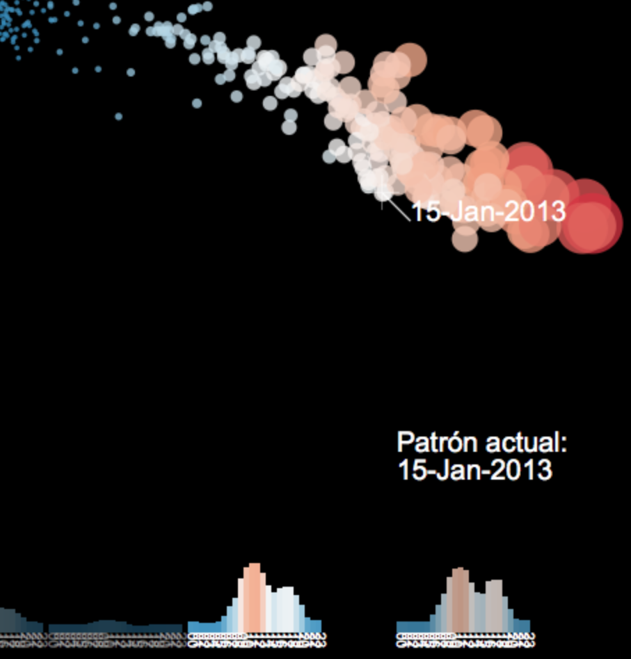 |
iDR visualization: Electic power demand | Interactive 2D map of electric power demand 24-hour patterns, organized by similarities. |
 |
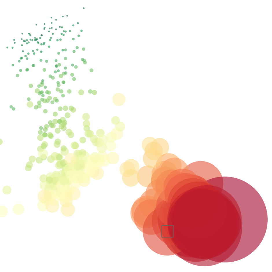
iDR visualization: Environmental patterns | Visualize an interactive map of electric stations (anonymized), organized by similarities on their emision signatures (6 parameters: SOx, NOx, Dust, etc.) |
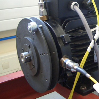 |
iDR visualization: map of vibration states | Interactive 2D projection of vibrational states, organized by similarities in a set of frequency bands of a rotating machine (induction motor) under mechanical imbalance (eccentric mass) and electrical imbalance (different levels of asymmetric load in one of the phases). |
| Note: in the iDR visualizations, the user can modify the weight of each variable in the computation of the similarity metrics, by dragging the mouse on the corresponding bar in the bottom-right corner. This has the effect of modifying the layout of the displayed elements to accommodate the user-driven changes in the similarity metrics |
| Actividad realizada en el marco del proyecto DPI2015-69891-C2-2-R, financiada por el Ministerio de Economía y Competitividad (MINECO), Programa Estatal de I+D+i Orientada a los Retos de la Sociedad y por el Fondo Europeo de Desarrollo Regional (FEDER) "Una manera de hacer Europa" |