en español
Matrix visualization
|
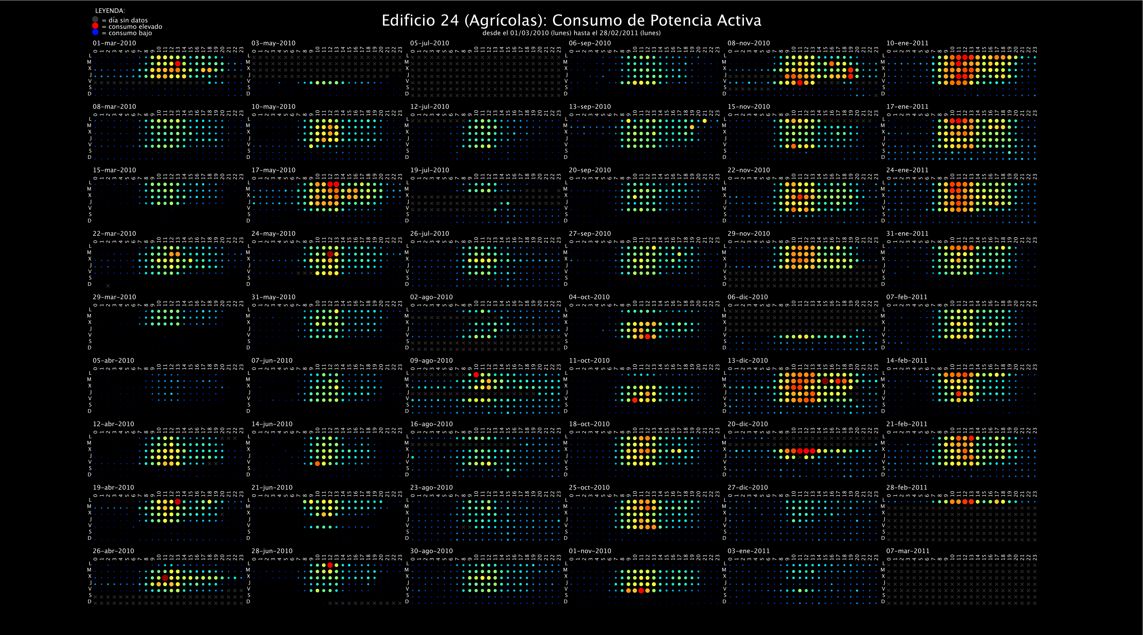
This picture shows a "calendar" type visualization of electric power demand in a university campus building. The positions of the data items have been organized into "week blocks" (24 hours x 7 days), so that the user can easily recognize demand patterns on weekday or day hour. The user can also quickly spot its location in the year. The demand values are represented using both color (blue = low demand, red = large demand) and size (large size = large demand). |
In the visualization it is easy to find low demand in weekends and holidays (e.g. Christmas) and low activity months (e.g. july). Also, time patterns showing activity increases between 11h and 14h, can be easily spot. This visualization is a good example of "small multiples", a visualization technique whereby the information is organized by grouping data into small items, all of them with a same structure, taking advance of known regularities. The resulting items (weeks organized as matrix blocks of weekday-by-hour, in this case) are visually comparable and make it easy for the user to find interesting patterns. |